07 · Concept · 2026
Roam
Book one great local experience in a new city, in four easy steps.
- Concept
- Travel
- Mobile
- Booking flow
- Trust & transparency
Overview
Roam helps travelers find and book one great local experience, like a sunset sail or a rooftop dinner, without scrolling through hundreds of tours. It shows a few hand-picked options run by locals and gets you booked in four steps. This is a concept project: it has not been tested with real users, and the prices, names and dates are sample data.
The problem
Travel apps show too many tours. In one city, 40 to 60+ companies can offer the same activity. People also don't know who runs it, what it will really cost, or what happens if plans change. So they keep scrolling, or don't book at all.
My role
- Solo, self-initiated concept. I did it all: problem, user flow, UX and visual design.
Context
This is a concept project, not a live product. The user is already in the city, on their phone, planning for tonight or tomorrow. So every step had to be quick, clear and easy with one hand.
Challenge
Too many choices
Fewer options can feel like less choice, so the short list has to feel hand-picked.
Trusting a stranger
You're meeting someone you don't know. People need to know the host before they pay.
Surprise costs
Fees that show up at the end make people feel tricked.
Fear of plans changing
If cancelling looks risky, people won't book.
Approach
- 01
Listed the 5 questions every traveler asks: What? Who? When? How much? What if?
- 02
Checked how GetYourGuide, Viator and Airbnb Experiences answer them.
- 03
Answered each question on the screen where it comes up, not at checkout.
- 04
Kept the look warm and simple, like a tip from a local friend.
Key UX decisions
- Problem
- Long lists make people compare forever.
- Decision
- Search shows only 2 hand-picked experiences, each with a reason it was chosen.
- Why it mattered
- Choosing becomes easy.
- Problem
- People don't want to pay a stranger.
- Decision
- The host's name, photo, experience and a verified badge come first on the details page.
- Why it mattered
- You trust the person before you look at the price.
- Problem
- Fees that appear at the end feel like a trick.
- Decision
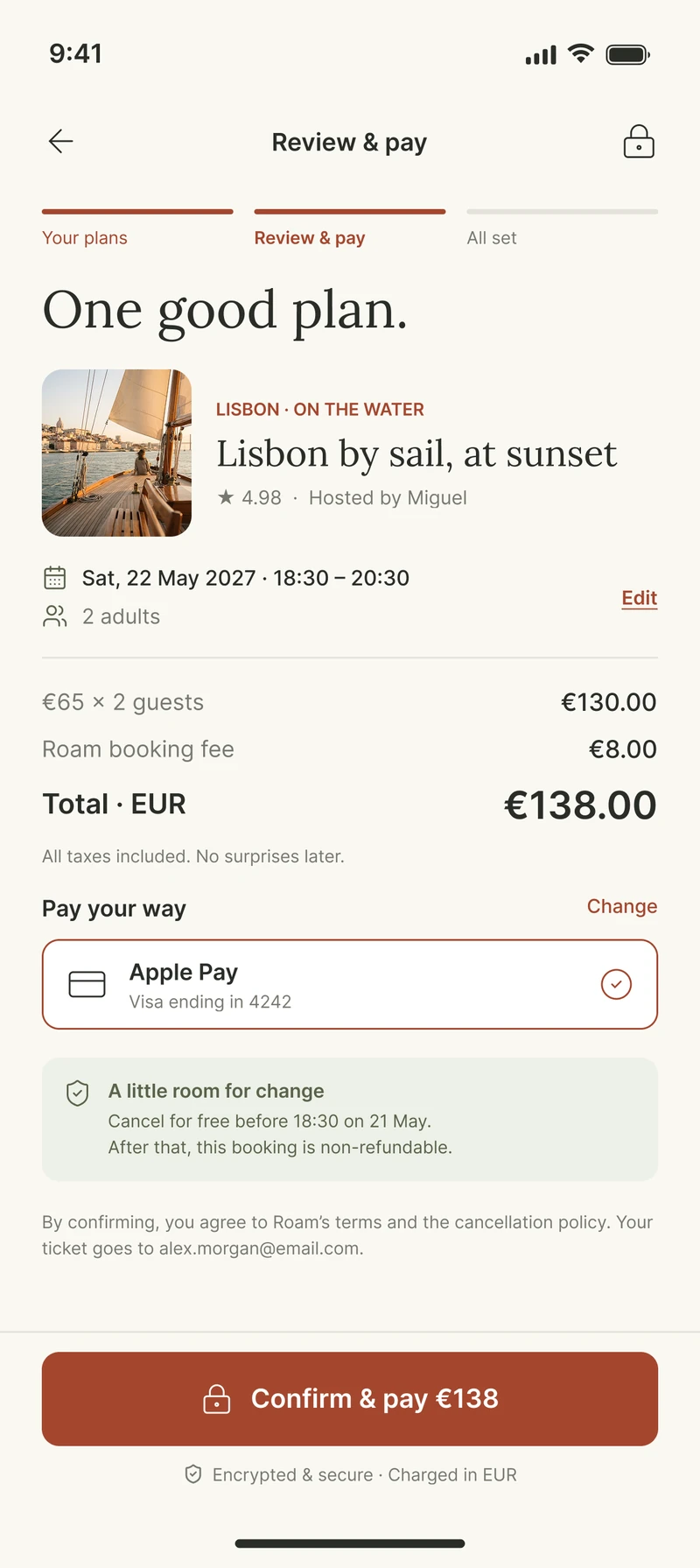
- The price says “before booking fee” early, and the fee gets its own line at review.
- Why it mattered
- The total never jumps at the last step.
- Problem
- Nobody reads long cancellation rules.
- Decision
- One line with the exact time: cancel free before 18:30 on 21 May.
- Why it mattered
- People book when they know they can back out.
- Problem
- After paying, people still ask “where do I go?”
- Decision
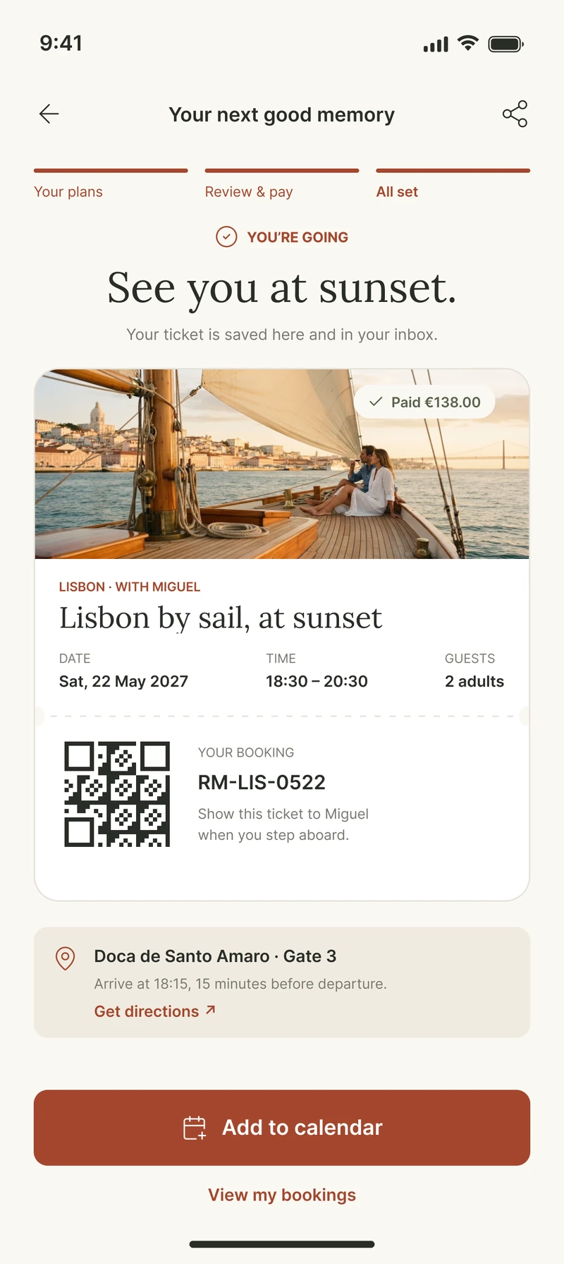
- The ticket shows the booking code, QR, meeting point, arrival time and directions.
- Why it mattered
- The flow ends when you're ready to go, not just when you've paid.
User flow
- 01
Discover
One top pick and a few local ideas
- 02
Search
City, date and guests give 2 hand-picked options
- 03
Decide
Photos, the host, duration and what's included
- 04
Pick a time
Date already filled; choose a slot and guests
- 05
Pay
Full price and the free-cancellation time, then one tap
- 06
Go
Ticket, meeting point and directions
A 3-step progress bar (Your plans, Review & pay, All set) shows how close you are to done.
Design system
Warm colors, a terracotta accent and serif headings, so it feels like a friend's tip, not a marketplace.
- Cards
- Photo, title, rating, duration and price.
- Mood chips
- Quick filters like “On the water” or “Food & drink”.
- Host block
- Name, photo and a verified badge.
- Progress bar
- 3 simple steps across the booking.
- Price breakdown
- Every cost on its own line.
- Info box
- Answers “what if” questions, like cancellation.
- Ticket
- Code, QR and meeting point.
Final experience
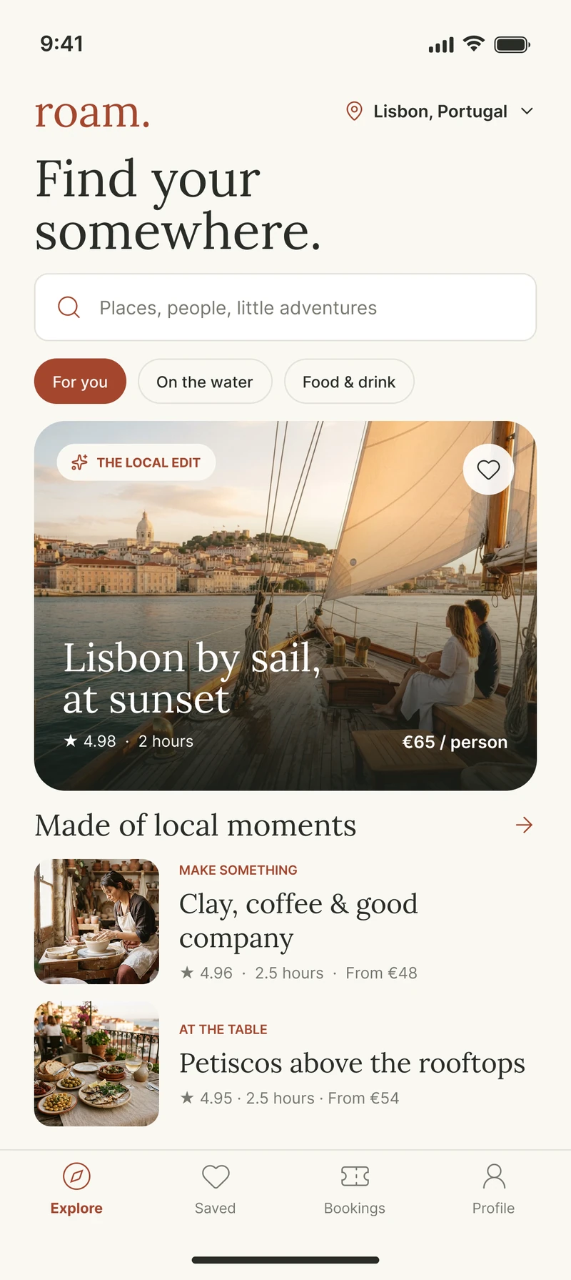
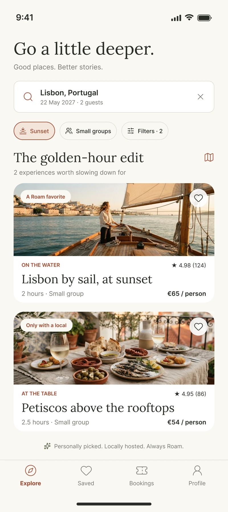
1. Discover
A short, hand-picked start, so choosing feels easy.
- 01
Discovery
A top pick and a few local ideas, filtered by mood.
- 02
Curated search
Just 2 options for your date, each with a reason it was chosen.
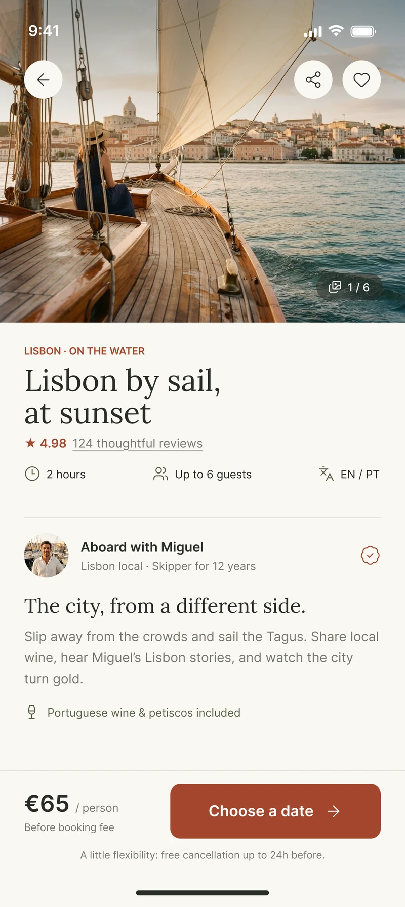
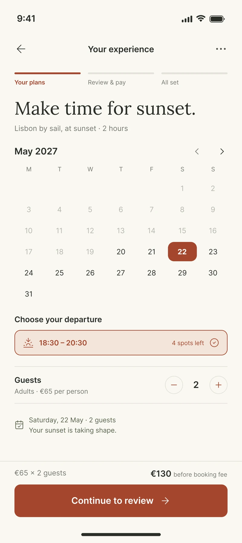
2. Decide
Meet the host, then pick a time. The price is clear from the start.
- 01
Experience detail
The host first, then duration, group size, languages and what's included.
- 02
Date and guests
Your date is already filled. Pick a time and see the total before the fee.
3. Book
One clear summary, then a ticket that tells you where to go.
- 01
Review and payment
Every cost on its own line, plus the exact time you can cancel for free.
- 02
Confirmed ticket
Code, QR, meeting point, arrival time and directions.
Outcome
- Designed the full 6-screen booking flow, from idea to ticket.
- Every question a traveler has (what, who, when, how much, what if) is answered before they pay.
- Concept project with sample prices, names and dates. Next step: test with 5 travelers.
A calm, hand-picked booking flow. A concept, not yet tested.
What I learned
Removing options only works if you explain why the remaining ones are good. And trust isn't built at checkout; it's built a little on every screen before it.