07 · Concept · 2026
Brief — From Info to Action
A mobile app that tells property owners, in one sentence, whether everything is fine, and helps them fix anything that isn't.
- Concept
- Property tech
- Mobile
- UX writing
- Accessibility
Overview
Brief is a mobile app for people who own more than one property. It keeps their papers in one place, keeps an eye out for problems, and tells them in one plain sentence whether everything is fine. When something needs attention, they can fix it with one tap.
The problem
People who own several properties keep their papers in many places: the sale deed with a lawyer, the EC in a WhatsApp chat, the tax receipt in a folder at home. Putting the papers in one app helps, but it doesn't solve the real worry: is everything alright with my properties, and would I know if it wasn't?
My role
- Designed the idea, the screens and every word on them, from start to finish.
- Set the point of view and a short list of design rules. Then designed the hard cases on purpose: no papers yet, forty papers, a request that fails, and coming back after six months.
- Checked the design against WCAG 2.2 AA and fixed what failed.
Context
This is a concept project, not a live product. I designed for someone who owns a few properties, earns well and has no time to chase paperwork. They are mostly in their forties or fifties. They use WhatsApp easily, but not complex apps. If something takes more than two taps to understand, they won't use it. They will call someone instead.
Challenge
A worry, not a task
People aren't asking where a document is. They're asking whether everything is fine. A list of files can't answer that.
Not tech-savvy
Anything that needs explaining fails. Every screen has to make sense at first look.
Trust
Property is high-stakes. The app has to be honest about what it knows and what it doesn't, without causing panic.
Real life is messy
Some people have no papers saved yet and some have forty. Requests fail. People disappear for months and come back.
Approach
- 01
Changed the question from “where is my document?” to “is everything fine?”. The papers became the proof, not the product.
- 02
Made the home screen one sentence, with a short, quiet list of properties below it.
- 03
Put every fix on the same screen as its problem, behind one clear button.
- 04
Designed the hard cases on purpose, and wrote every screen in one calm voice, like a trusted family accountant.
Key UX decisions
- Problem
- A list of files doesn't answer the owner's real worry.
- Decision
- The home headline says “All quiet.” or “One thing needs you. The rest is fine.”, and the list of properties sits below it.
- Why it mattered
- The answer comes before anyone has to look for it.
- Problem
- Spotting a problem and fixing it are usually two separate jobs, so people give up and call someone.
- Decision
- The problem card has one button, “Get a fresh one for me”. It opens a confirm screen showing the cost and time before anything happens.
- Why it mattered
- A chore becomes a tap, and nobody is surprised by the price.
- Problem
- A property can have forty papers, and a long list hides the few that matter.
- Decision
- Ownership, EC and tax papers show first. Everything else sits behind one row and one search box.
- Why it mattered
- The screen looks the same with 4 papers or 400.
- Problem
- “Something was filed on your land” is scary, and it is often routine. A guess could cause panic or false comfort.
- Decision
- Say what happened, what it might mean, and “we can't tell from here, so we won't guess”. Offer two ways to act and one way to dismiss it.
- Why it mattered
- Being honest builds trust, and the owner stays in charge of the decision.
- Problem
- A failed request feels risky when money is involved.
- Decision
- Give the facts first, then the comfort: “That didn't go through. You haven't been charged.” Keep trying, and message them on WhatsApp.
- Why it mattered
- People stay calm when they know what happened and that they're safe.
- Problem
- Forms and uploads are where non-technical users give up.
- Decision
- Adding a property starts with a photo on WhatsApp or a survey number. Alerts and receipts arrive on WhatsApp too.
- Why it mattered
- It meets people where they already are.
User flow
- 01
Notice
Home says what is true, in one sentence
- 02
Understand
A plain explanation, with no guessing
- 03
Decide
Get it, talk to someone, or dismiss it
- 04
Confirm
See the cost and time before you agree
- 05
Done
What we did, what's next, and a WhatsApp message
- 06
Watch
Back to “All quiet.”
Fixing an expired paper takes three taps: the button on the home screen, “Yes, get it”, and back.
Design system
A small, strict system so every screen feels the same. I checked it against WCAG 2.2 AA by measuring the colours and reading the markup.
- Type
- One typeface, Figtree, in three sizes (30, 17 and 16). Nothing is smaller than 16px.
- Colour
- A warm paper background, one deep green for actions, and amber only where something needs attention.
- Contrast
- Body text is 16.6:1, small grey text 4.9:1 and button text 9.1:1. My check caught two failures, amber text on its label (4.3:1) and the search border (1.2:1). I fixed both.
- Touch
- Every button, link and list row is at least 44px tall, with one full-width button per screen.
- Not colour alone
- Status is always a word plus a dot: “Needs you” or “All good”. Nobody has to tell amber from green.
- Structure
- One heading per screen, a visible label on every field, and a clear outline when moving with a keyboard.
Final experience
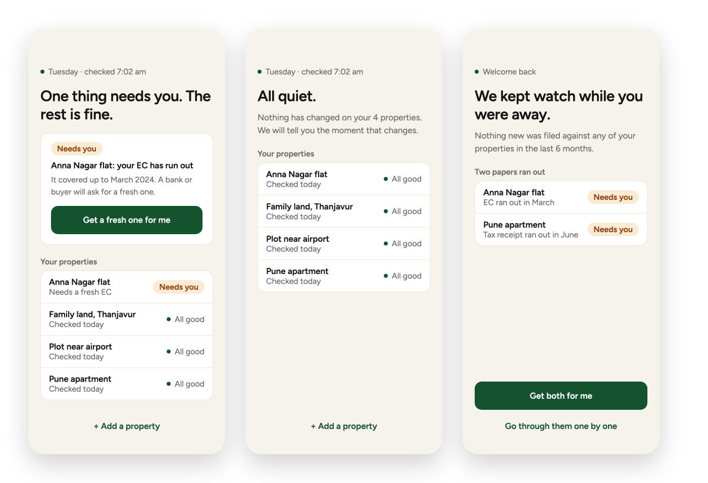
1. Home, in three moods
The top sentence answers the worry before anyone looks for anything. It changes with the situation.
- 01
Needs you
One thing needs attention. The card says what and why, with one button to fix it.
- 02
All quiet
Nothing has changed. The screen says so, and stays calm.
- 03
Welcome back
For someone returning after months. It starts with the good news, then shows what ran out.
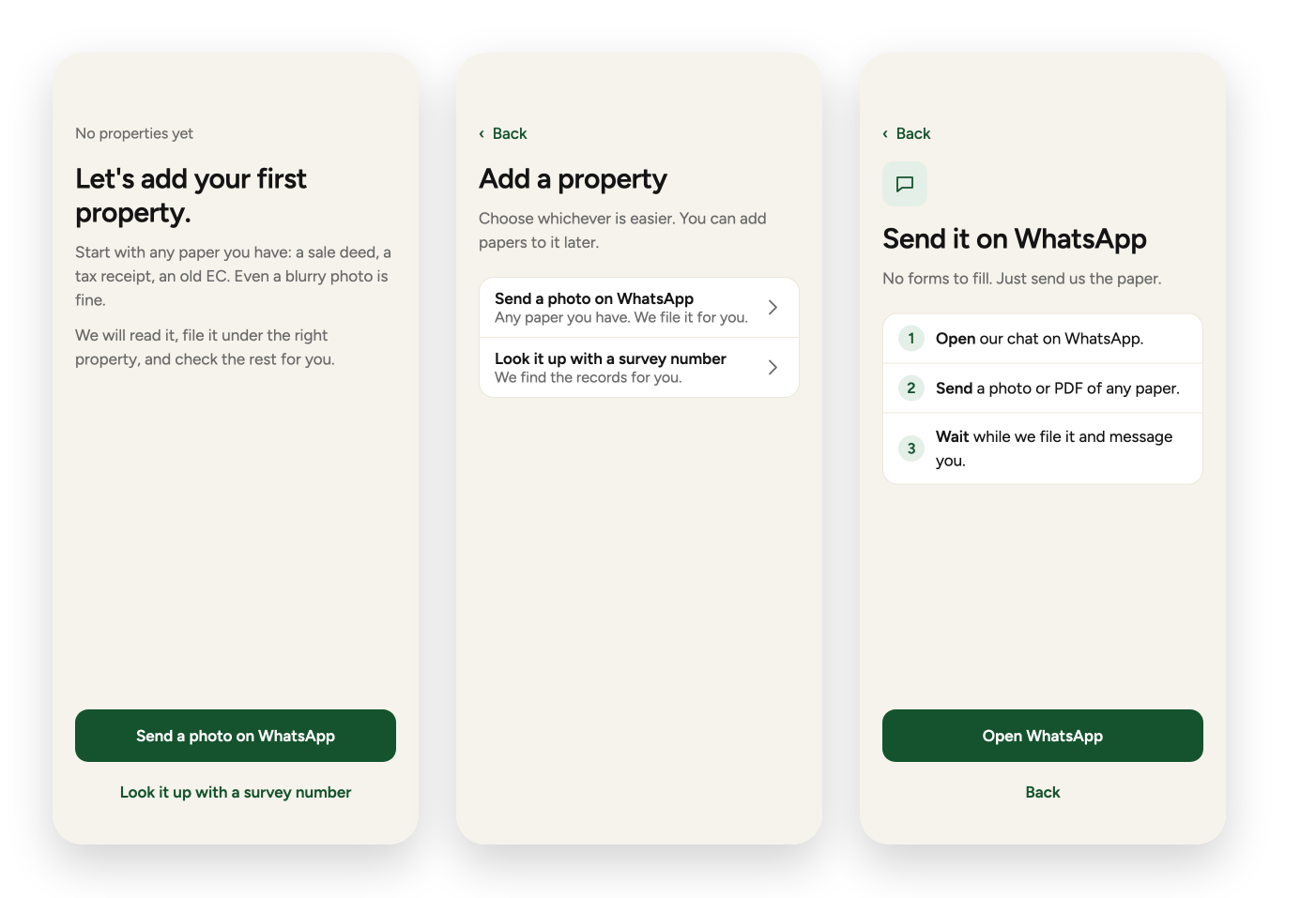
2. Getting started
Two easy ways to add a property, both things people already do.
- 01
First time
No papers yet. There's no empty grid, just two ways to begin.
- 02
Add a property
For people who already have properties: send a photo on WhatsApp, or look it up with a survey number.
- 03
Send on WhatsApp
Three short steps. There are no forms to fill in.
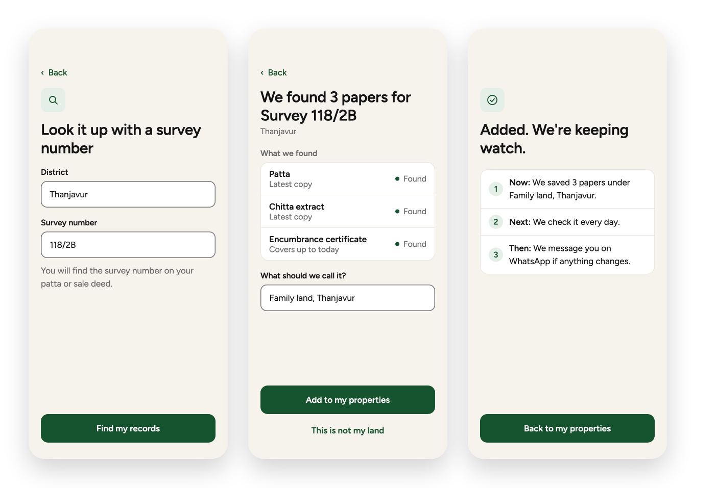
3. Look it up
Type a survey number and we find the records. Nothing is saved until you say so.
- 01
Look it up
Only two fields, district and survey number, with a hint about where to find the number.
- 02
We found
Shows what was found and lets you name the property. There's a way out: “This is not my land”.
- 03
Added
Confirms what we did and what happens next.
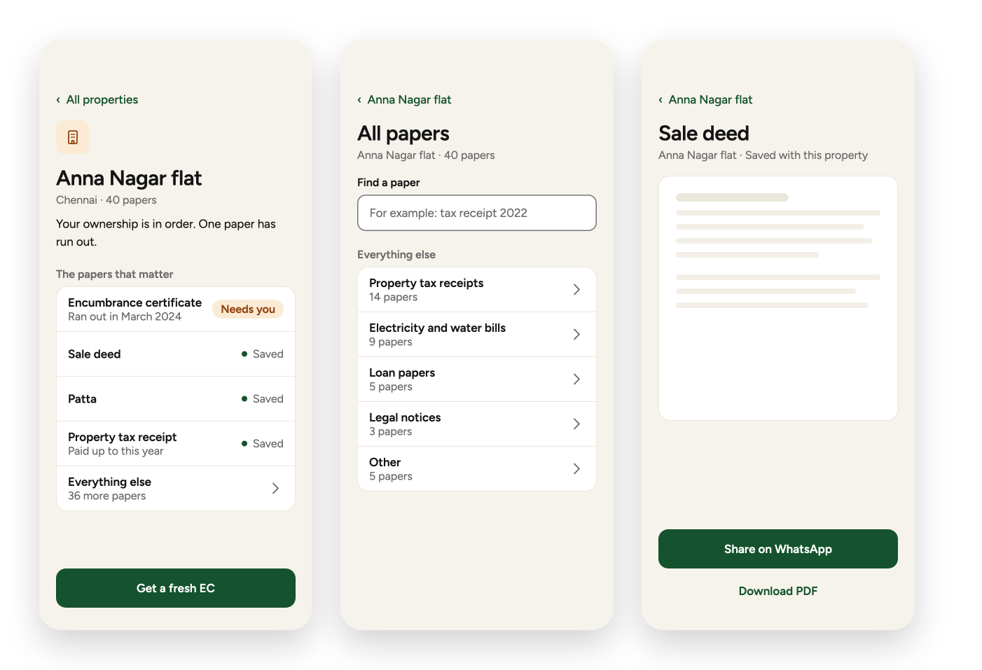
4. Inside a property
The papers that matter come first. Everything else is one tap away.
- 01
One property
The papers that matter, with the one that needs attention shown first.
- 02
All papers
The other papers, grouped, with a search box. It works the same with 40 papers or 400.
- 03
One paper
Open a paper, then share it on WhatsApp or download it. Handy when a bank asks for it.
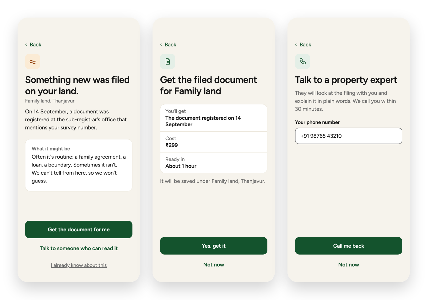
5. When something is filed
The scary moment, handled in three parts: what happened, what it might mean, and what you can do.
- 01
Something new was filed
Honest about what we don't know. Two ways to act, and one way to dismiss it.
- 02
Get the document
Shows what you'll get, the cost and the time before you agree.
- 03
Talk to an expert
For people who would rather speak to someone. Confirm your number and we call you back.
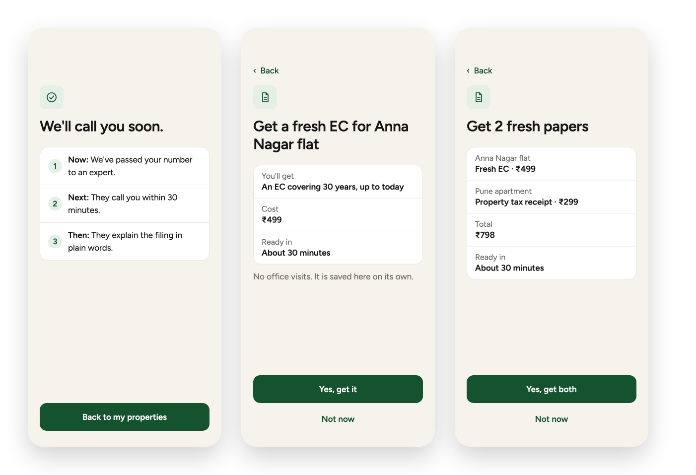
6. Asking for papers
Every request shows the same three things before you agree: what you get, the cost and the time.
- 01
We'll call you soon
Confirms the call and says what happens next.
- 02
Get a fresh EC
The confirm screen for one paper.
- 03
Get two papers
The same, for two papers at once, with the total.
Outcome
- A clear, calm concept: one sentence answers the owner's worry, and every problem has one button that fixes it.
- It hasn't been tested with users and I haven't measured anything yet. The prices, times and names on the screens are made up.
- The idea depends on being able to spot new filings against a survey number. I'd confirm that is possible before promising it on screen.
- Next I'd test it with five owners over 45 (can they say in five seconds whether their properties are fine?), write the voice in Hindi and Tamil, and design how a spouse or child gets access.
A calm, action-first property app. A concept, not yet tested.
What I learned
People don't want to manage documents. They want to stop worrying. The best thing this design can do is stay quiet when everything is fine, and when it isn't, speak plainly and offer one clear next step.